author image

We’ve all been there: staring at a blank, white Google Slides, knowing the information we have is valuable, but not knowing how to make Google Slides look good. This guide covers actionable steps to instantly make your Google Slides look aesthetic. Let’s dive in.

Before we dive into the “how,” let’s touch on the “why.” A visually appealing presentation does more than just look pretty. It:

  • Boosts Credibility: A polished design signals professionalism and attention to detail.
  • Increases Engagement: A creative, eye-catching, and informational Google Slide keeps your audience focused and prevents their minds from wandering.
  • Improves Retention: Clear, well-organized visuals help people understand and remember your key messages.

Ready to make your Google Slides look doog and aesthetic? Let’s get started.

How to Make Google Slides Look Aesthetic

1. Keep Consistent
Consistency is the bedrock of professional design. Your audience should feel like they are viewing one cohesive story, not a random collection of slides. The easiest way is to use the “Master Slide”.

  • What it is: In Google Slides, go to View > Theme builder. This is your Master Slide. Any change you make here will automatically apply to all slides using that layout.

    make google slides look better by using master slides

  • How to use it: Instead of manually adjusting each slide, invest five minutes setting up your Master Slide. Define your title slide, section headers, and main content layouts.
workppt banner 2
Don’t want to design manually?

Try AI presentation maker-WorkPPT to generate a consistent theme and layout slides in seconds.

2. Typography & Palette
To make your Google Slides look aesthetic, you need a thoughtful approach to your color palette and typography.

  • Harmonious Color Palette:The secret to beautiful slides isn’t using lots of different colors, but using a few colors well. Think of it like putting together an outfit.
  • Font Pairing:Less is more. Stick to a maximum of two fonts: one for headers and one for body text.

3.High-Impact Visuals
Visuals break up content, add emotional impact, and make complex information easier to digest.

  • Images: Use high-resolution images only. Blurry or pixelated photos look unprofessional.
  • Icons: Replace boring bullet points with icons. Icons are a fantastic way to represent concepts visually and make your slides more scannable and engaging.
  • Data Visualization: When presenting data, keep your charts and graphs simple. Use your accent color to highlight the most important data point.

How to Make an Eye-catching Informational Google Slides

When presenting data-heavy content, creativity is essential. Here’s how to make a creative eye-catching informational Google Slide:

1. Replace text-heavy sections with infographics or charts.

2. Use animations and transitions to highlight key points.

3. Experiment with contrast and layout variations (e.g., split-screen, diagonal sections).

Best Tools and Resources to Make Slideshow Look Good

While creative layouts and multimedia can make your slides stand out, design often comes down to having the right resources and tools at hand. Here are some we recommend:

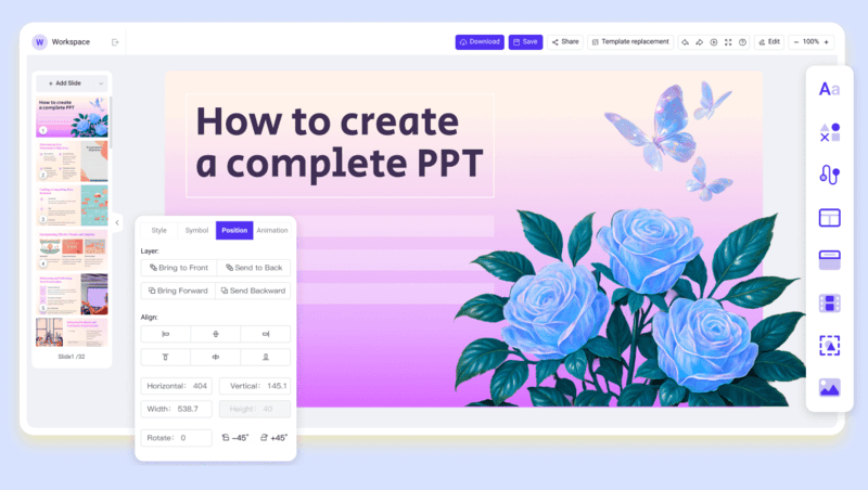
While external tools for colors, fonts, and templates are helpful, they often take time to combine and customize. WorkPPT AI presentation maker solves this problem by providing an all-in-one platform that designs professional slides instantly.

make google slides look better with workppt

💡 What you’ll get from WorkPPT:

  • Template library: WorkPPT comes equipped with a rich library of professionally designed border templates ready for you to use.
  • Creative & Aesthetic Designs: Every slide is optimized for balance, color harmony, and visual impact.
  • Seamless export: Export presentations to both Google Slides and PowerPoint (PPTX) without formatting issues.
  • Time-Saving: No need to jump between design tools; WorkPPT gives you a finished deck in one click.

Watch this video to learn about how WorkPPT creates aesthetic slides in seconds:

FAQs: How to make a Google Slides Look Good

Q: How do I make my Google Slides look professional?

A: Use consistent fonts, clean layouts, and minimal text. To save time, WorkPPT AI Presentation Maker offers ready-to-use professional templates.

Q: How to make slides more visually appealing?

A: Focus on contrast, clear hierarchy, and strong visuals. Replace text with charts or icons whenever possible to increase engagement.

Q: Can I add unique fonts and colors to Google Slides?

A: Yes. You can upload custom fonts and use tools like Adobe Color for palettes.

Q: What is the 60-30-10 rule in slides?

A: This design principle suggests using 60% dominant color, 30% secondary color, and 10% accent color for balance and harmony in your presentation.

Q: How much animation should I use in Google Slides?

A: Keep animations minimal—use them only to emphasize key points. Too many effects can distract from your message.

💬 Conclusion:

Learning how to make slideshows look good is a valuable skill. While mastering these skills manually is rewarding, remember that modern tools are here to help you work smarter, not harder. WorkPPT is the fastest way to achieve professional, eye-catching slides.

workppt banner

Design Smarter with WorkPPT AI

Tired of spending hours designing your Google Slides? Try WorkPPT for free today and transform plain slides into eye-catching presentations!