author image
Adding graphs to Google Slides is the fastest way to make your presentation more visual and persuasive. Unlike plain data tables, a clear graph help your audience spot trends at a glance. This guide will walk you through the types of charts Google Slides supports, how to make a graph in Google Slides, and answers to common questions.

Google Slides offers several chart types to help you present data clearly. The most commonly used include the following categories:

TypeCommon Use
Bar GraphIdeal for horizontal comparisons between different categories
Line ChartBest suited for displaying trends over time
Pie ChartHighlights proportions or percentages
Column GraphShows differences between distinct groups
Area ChartEffectively presents cumulative growth trends

👉When selecting a chart type, focus not just on the visual style but on whether it clearly communicates your data.

workppt banner

Design Smarter with WorkPPT AI

Tired of spending hours designing your Google Slides? Try WorkPPT for free today and transform plain slides into eye-catching presentations!

How to Make a Graph in Google Slides

The detailed steps of how to make a graph on Google Slides is straightforward:

Step 1: Open your Google Slides and go to the slide where you want to insert the graph.

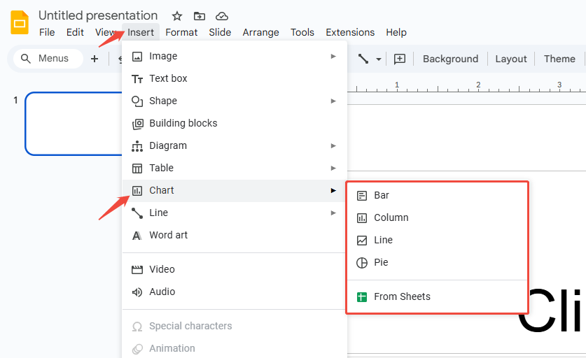
Step 2: Click “Insert” at the top, then select graph from the dropdown menu. Pick the appropriate chart type (bar, column, line, pie).

insert chart in google slides

Step 3: Click the graph to ensure, and the graph will appear on your slide.

Step 4: To edit chart data, click “Open source” in the chart’s top-right corner.

click open source to edit data

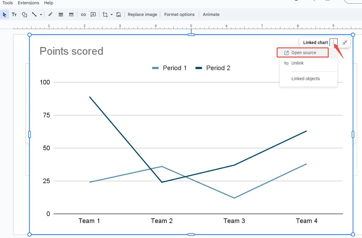
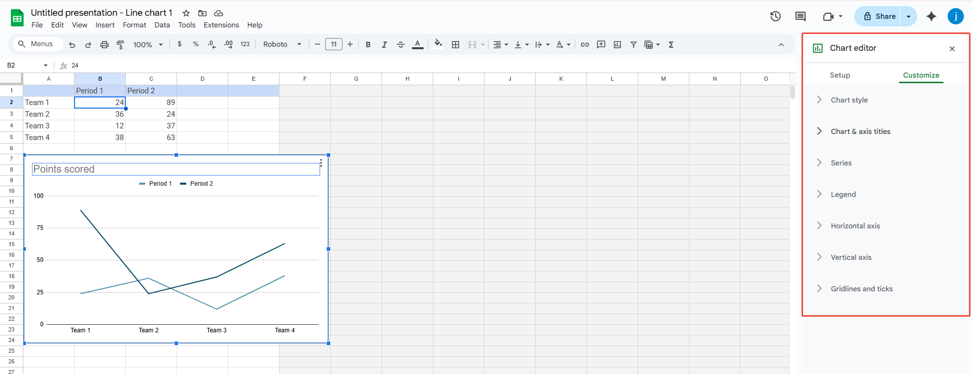
Step 5: A new Google Sheets window will open, allowing you to replace data with actual figures.

edit the data in google sheets

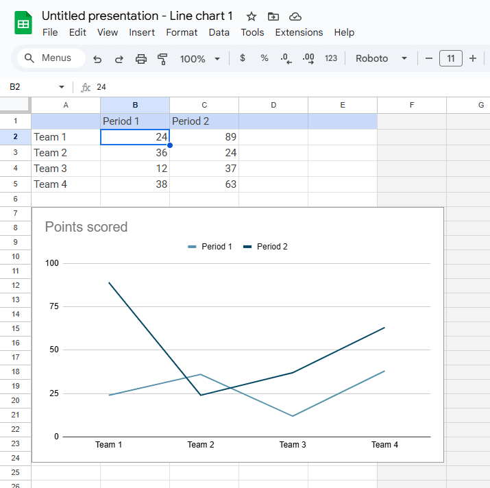
Step 6: After updating the data, changes in the spreadsheet will automatically sync to the graph in Google Slides.

Step 7: To customize the graph’s colors, style, or title, double-click the chart icon and adjust settings in the “Customize” panel.

adjust charts style in google sheets

Note: If your data is already in Google Sheets, just link it to your slide. The graph will update automatically, so you don’t have to redo the work.

workppt banner 2
Don’t want to design manually?

Try AI presentation maker-WorkPPT to generate a consistent theme and layout slides in seconds.

How to Format Charts in Google Slides

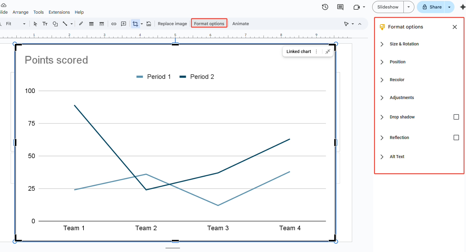
After inserting a graph on Google Slides, you can enhance its appearance to fit your presentation’s overall style:

  • Size & Rotation: Adjust width, height, or rotate it by dragging.
  • Position: Move the graph to the corner, center, or anywhere you like.
  • Recolor: Change the color scheme to match your slides.
  • Adjustments: Tweak chart opacity, brightness, and contrast.
  • Drop shadow: Add shadows and edit their color, angle, distance, or blur.
  • Reflection: Apply reflections and control their opacity, size, and distance.
  • Alt Text: Add descriptive text to charts for improved accessibility.

adjust charts style in google slides

FAQs about How to Make a Graph on Google Slides

Q: Can I copy Excel charts directly into Google Slides?

A: Yes, but no data link will be established. For real-time updates, import the data into a Google Sheet and create a link.

Q: Can I add animations to charts in Google Slides?

A: Basic entry animations can be applied, but Google Slides does not support advanced chart animations available in Excel or PowerPoint.

Q: How do I modify chart data later?

A: Right-click the chart > Open data source. This opens the linked Google Sheet where you can edit the data.

Q: Can I download charts as images?

A: Yes. In Google Sheets, right-click the chart > Download. You can then insert it as an image into your slide.

💬 Conclusion:

Graphs make data more intuitive and enhance the professionalism of your presentations. By learning how to insert and customize them, you can make your slides more engaging and convincing. Instead of showing raw numbers, use graphs to tell the story behind your data and help your audience get it instantly.