PowerPoint venn diagrams are perfect for showing overlap—shared features, audiences, responsibilities, tech stacks, you name it. In this guide you’ll learn five fast ways to make clean, readable Venns in PowerPoint, plus pro styling, animation, templates, and troubleshooting.
- What Is a Venn Diagram?
- Method 1 — Create Venn Diagram in PowerPoint with SmartArt
- Method 2 — Create Your Venn Diagram with Shapes
- Method 3 — Convert SmartArt to Shapes for Fine Control
- Method 4 — Merge/Fragment for Colorable Intersections
- Method 5 — Templates (Consistent, On-Brand)
- Faster Option: Build Venn Slides with WorkPPT AI Presentation Maker
What Is a Venn Diagram?
- Comparing products, ideas, or concepts
- Visualizing logical relationships
- Explaining intersections and differences
- Displaying survey or research data
Method 1 — Create Venn Diagram in PowerPoint with SmartArt
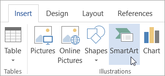
The fastest way to insert a Venn diagram in PowerPoint is with SmartArt:
- 1. on PowerPoint, click Insert > SmartArt

- 2. Choose Relationship in the sidebar
- 3. Select Basic Venn

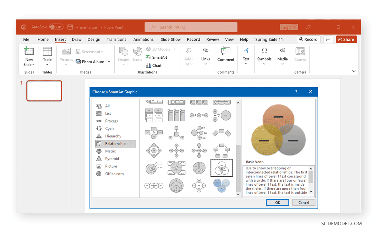
- 4. Click OK to insert onto your slide
Pros:
- Quick and easy
- Built-in text boxes
- Easy to add or remove circles
Cons:
- Limited customization (colors, shapes, overlaps)
- Harder to animate individual sets or overlaps
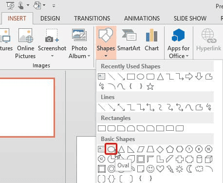
✍ [More Chart Insertion Guide]:
Method 2 — Create Your Venn Diagram with Shapes
- 1. Go to Insert > Shapes > Oval

- 2. Draw the first circle. Copy (Ctrl+C) and Paste (Ctrl+V) to make more circles
- 3. Overlap as needed for 2 or 3 sets
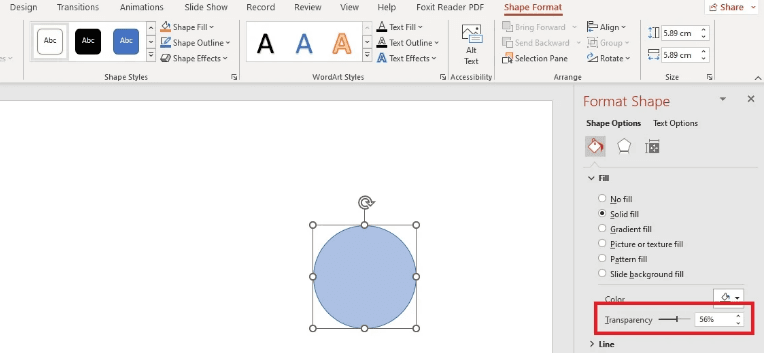
- 4. Select each circle, right-click, Format Shape > Fill > Transparency (set 30–50% for clear overlaps)

- 5. Add text boxes for labels and data
- 6. Group everything (Ctrl+G) to move as one
Why use Shapes?
- Customize size, overlap, and colors
- Layer icons, labels, or images
- Animate parts individually
Method 3 — Convert SmartArt to Shapes for Fine Control
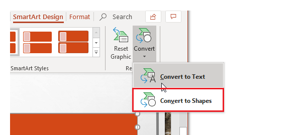
Want SmartArt speed and segment control?
- 2. Build your Venn with SmartArt (Method 1).
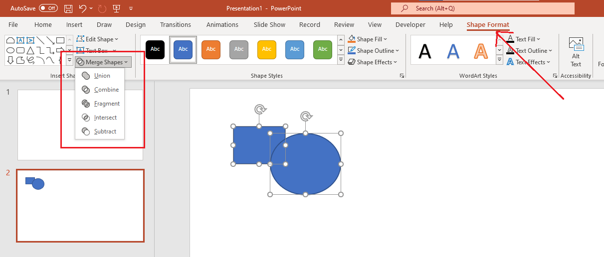
- 3. Select the SmartArt → SmartArt Design › Convert › Convert to Shapes.

- 4. Ungroup (Ctrl/Cmd + Shift + G) until each circle is a normal shape.
- Now you can Shape Format › Merge Shapes to create custom segments.
Method 4 — Merge/Fragment for Colorable Intersections
To color each intersection differently (great for teaching or storytelling):
- 1. Start from three overlapped circles (Method 2 or 3).
- 2. Duplicate the whole group (keep a backup).
- 3. Select the front copy → Shape Format › Merge Shapes › Fragment.
- 4. You’ll get many little pieces—each intersection is now its own shape.
- 5. Color segments individually; add subtle outline (0.5–1 pt) if needed.

Merge Shapes quick guide:
- Union = make one big shape
- Combine = punch out overlaps
- Fragment = split into all pieces
- Intersect = keep only overlaps
- Subtract = remove top from bottom
Method 5 — Templates (Consistent, On-Brand)
- Save your favorite Venn slide as a custom template (Save as Template)
- Build variants: 2-circle, three-circle (triple Venn), 4-circle with legends, icon-based Venns
- Store in a shared brand template so colors and fonts stay consistent
Faster Option: Build Venn Slides with WorkPPT AI Presentation Maker
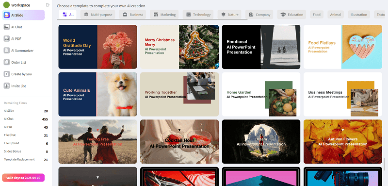
If you want to skip manual layout:
- Type your sets and relationships (e.g., “A, B, C; show A∩B, A∩C, B∩C, and A∩B∩C”).
- Choose 2/3/4-circle Venn types; pick a brand palette.
- Get an instant, editable PowerPoint slide from WorkPPT AI Presentation Maker, with 5,000+ templates, online editing, multi-language support, slide animations, and multiple export formats.
- Perfect when you need several Venn variations for different audiences fast.

⭐728323 presentations made
See how to quickly create slides using WorkPPT:
Three-Circle Venn: Layout, Design & Animation
- Layout: Keep circles identical; place centers as an equilateral triangle.
- Transparency: Set fills to 25–40% so overlaps stay legible.
- Labeling: If overlap text is cramped, use callouts or a legend.
- Color-blind safety: Avoid red/green pairs; prefer blue/orange/purple with strong contrast.
- Complexity rule: More than 4–5 circles hurts readability—consider an Euler diagram or a table.
- Focus: One purpose per Venn—don’t overload with unrelated notes.
- Palette: Use 2–3 colors and vary with transparency instead of adding more hues.
- Typography: Keep text 18–24 pt on typical slides; avoid tiny labels inside overlaps.
- Contrast: Ensure accessible contrast (dark text on light fills or the reverse).
- Icons: Use sparingly—one small icon per set is enough.
- Animation: Reveal circles with Appear/Fade in sequence; use Morph between slides to spotlight an intersection; animate labels after shapes; keep timing brisk (0.2–0.4s each).
Troubleshooting & Power Tips
Circles won’t align: select all → Align Middle and Align Center; use Snap to Grid/Guides.
Text overflow: reduce text; break lines; move labels outside with callouts; increase circle size.
Overlaps look muddy: lighten fills or increase transparency; add thin outlines.
Printing looks dull: avoid very light transparencies; consider solid fills with Fragmented segments instead.
Export for reuse: File › Export › PNG/JPG/SVG (try 300 dpi for documents).
Aspect ratio: design for 16:9 (modern screens). If you must deliver 4:3, reposition before export.
💬 Conclusion:
You’ve seen the essentials—from SmartArt quick builds to precise Shapes, Merge/Fragment, clean triple-Venn layouts, readable design, and light-touch animation.
If you’re short on time or need multiple variants, I personally use WorkPPT – best AI maker: type your sets, pick 2/3/4-circle Venns, and get polished, editable slides in minutes. Generate first, then tweak—fast, consistent, and on-brand.
Say Goodbye to Hard PPT Editing!
No need for any professional skills. Quickly create a PPT and export it in multiple formats(PDF, PPTX, PNG, JPG).

My brother suggested I would possibly like this website.
He was once totally right. This put up truly made my day.
You cann’t believe just how a lot time I had spent for this information!
Thanks!
I love how you broke down different ways to create Venn diagrams, especially the option of using shapes for more customization. It’s great that you also touched on merging and fragmenting, which can really make the diagrams stand out!