
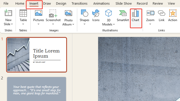
1. Launch PowerPoint and navigate to the slide where you want to insert the chart.
2. Click “Insert” → “Chart”.
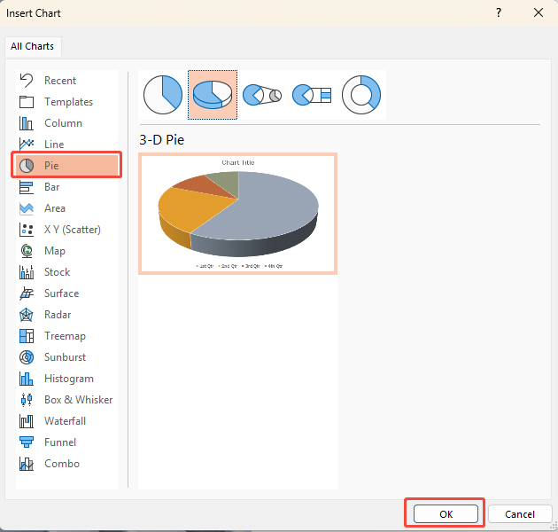
3. In the pop-up window, select “Pie”, choose a style you like, and click “OK”.
4. A pie chart and a small Excel table will appear on your slide.
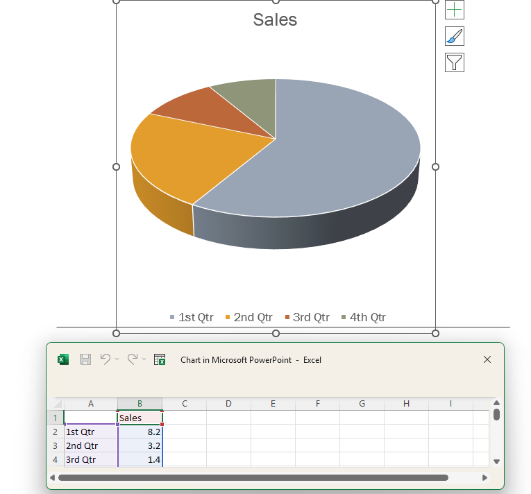
5. Enter your data percentages into the table, then close the spreadsheet.
Want to take it a step further? Keep reading for tips on how to edit pie charts like a pro.
Or, if you want to skip the hassle, let WorkPPT handle it. This AI slides maker turns your data into clean, eye-catching slides in seconds—no manual fiddling, no mistakes, just smooth results.

1. Adjust Colors
Default colors often look dull or confusing. Go to “Chart Design” → “Change Colors” and pick a high-contrast palette so each slice stands out.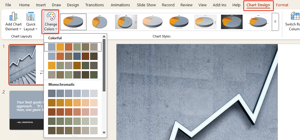
2. Highlight a Specific Segment
To emphasize specific data, click the corresponding slice and drag it slightly outward to draw immediate attention.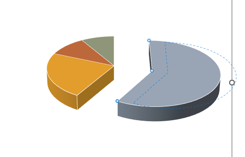
3. Add Data Labels
Numbers make things clearer. Click the chart, hit the “+” icon, and check “Data Labels” to show percentages. You can also choose other display options under More.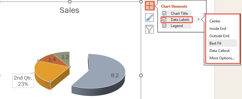
Some people like building charts in Excel, then moving them into PowerPoint. It works better for larger datasets and gives more control:
1. Enter your data into an Excel spreadsheet.
2. Select the data range, then click “Insert” → “Pie Chart”.
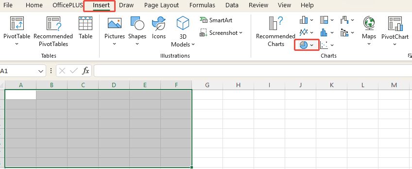
3. Excel will automatically generate the pie chart, and you can adjust its style using the toolbar.
4. Once edited, simply copy it directly into PowerPoint.
If your data changes often, Excel is the smarter choice. It supports formulas and updates charts automatically, while PowerPoint charts are more static.
Thank you a bunch for sharing this with all of us you really recognize what you are speaking about!
Bookmarked.
Good write-up. I absolutely love this site. Keep it up!